The W3C HTML WG and the WHATWG are currently discussing the introduction of a <main> element into HTML.
The <main> element has been proposed by Steve Faulkner and is specified in a draft extension spec which is about to be accepted as a FPWD (first public working draft) by the W3C HTML WG. This implies that the W3C HTML WG will be looking for implementations and for feedback by implementers on this spec.
I am supportive of the introduction of a <main> element into HTML. However, I believe that the current spec and use case list don’t make a good enough case for its introduction. Here are my thoughts.
Main use case: accessibility
In my opinion, the main use case for the introduction of <main> is accessibility.
Like any other users, when blind users want to perceive a Web page/application, they need to have a quick means of grasping the content of a page. Since they cannot visually scan the layout and thus determine where the main content is, they use accessibility technology (AT) to find what is known as “landmarks”.
“Landmarks” tell the user what semantic content is on a page: a header (such as a banner), a search box, a navigation menu, some asides (also called complementary content), a footer, …. and the most important part: the main content of the page. It is this main content that a blind user most often wants to skip to directly.
In the days of HTML4, a hidden “skip to content” link at the beginning of the Web page was used as a means to help blind users access the main content.
In the days of ARIA, the aria @role=main enables authors to avoid a hidden link and instead mark the element where the main content begins to allow direct access to the main content. This attribute is supported by AT – in particular screen readers – by making it part of the landmarks that AT can directly skip to.
Both the hidden link and the ARIA @role=main approaches are, however, band aids: they are being used by those of us that make “finished” Web pages accessible by adding specific extra markup.
A world where ARIA is not necessary and where accessibility developers would be out of a job because the normal markup that everyone writes already creates accessible Web sites/applications would be much preferable over the current world of band-aids.
Therefore, to me, the primary use case for a <main> element is to achieve exactly this better world and not require specialized markup to tell a user (or a tool) where the main content on a page starts.
An immediate effect would be that pages that have a <main> element will expose a “main” landmark to blind and vision-impaired users that will enable them to directly access that main content on the page without having to wade through other text on the page. Without a <main> element, this functionality can currently only be provided using heuristics to skip other semantic and structural elements and is for this reason not typically implemented in AT.
Other use cases
The <main> element is a semantic element not unlike other new semantic elements such as <header>, <footer>, <aside>, <article>, <nav>, or <section>. Thus, it can also serve other uses where the main content on a Web page/Web application needs to be identified.
Data mining
For data mining of Web content, the identification of the main content is one of the key challenges. Many scholarly articles have been published on this topic. This stackoverflow article references and suggests a multitude of approaches, but the accepted answer says “there’s no way to do this that’s guaranteed to work”. This is because Web pages are inherently complex and many <div>, <p>, <iframe> and other elements are used to provide markup for styling, notifications, ads, analytics and other use cases that are necessary to make a Web page complete, but don’t contribute to what a user consumes as semantically rich content. A <main> element will allow authors to pro-actively direct data mining tools to the main content.
Search engines
One particularly important “data mining” tool are search engines. They, too, have a hard time to identify which sections of a Web page are more important than others and employ many heuristics to do so, see e.g. this ACM article. Yet, they still disappoint with poor results pointing to findings of keywords in little relevant sections of a page rather than ranking Web pages higher where the keywords turn up in the main content area. A <main> element would be able to help search engines give text in main content areas a higher weight and prefer them over other areas of the Web page. It would be able to rank different Web pages depending on where on the page the search words are found. The <main> element will be an additional hint that search engines will digest.
Visual focus
On small devices, the display of Web pages designed for Desktop often causes confusion as to where the main content can be found and read, in particular when the text ends up being too small to be readable. It would be nice if browsers on small devices had a functionality (maybe a default setting) where Web pages would start being displayed as zoomed in on the main content. This could alleviate some of the headaches of responsive Web design, where the recommendation is to show high priority content as the first content. Right now this problem is addressed through stylesheets that re-layout the page differently depending on device, but again this is a band-aid solution. Explicit semantic markup of the main content can solve this problem more elegantly.
Styling
Finally, naturally, <main> would also be used to style the main content differently from others. You can e.g. replace a semantically meaningless <div id=”main”> with a semantically meaningful <main> where their position is identical. My analysis below shows, that this is not always the case, since oftentimes <div id=”main”> is used to group everything together that is not the header – in particular where there are multiple columns. Thus, the ease of styling a <main> element is only a positive side effect and not actually a real use case. It does make it easier, however, to adapt the style of the main content e.g. with media queries.
Proposed alternative solutions
It has been proposed that existing markup serves to satisfy the use cases that <main> has been proposed for. Let’s analyse these on some of the most popular Web sites. First let’s list the propsed algorithms.
Proposed solution No 1: Scooby-Doo
On Sat, Nov 17, 2012 at 11:01 AM, Ian Hickson <ian@hixie.ch> wrote:
| The main content is whatever content isn't
| marked up as not being main content (anything not marked up with <header>,
| <aside>, <nav>, etc).
This implies that the first element that is not a <header>, <aside>, <nav>, or <footer> will be the element that we want to give to a blind user as the location where they should start reading. The algorithm is implemented in https://gist.github.com/4032962.
Proposed solution No 2: First article element
On Sat, Nov 17, 2012 at 8:01 AM, Ian Hickson  wrote:
| On Thu, 15 Nov 2012, Ian Yang wrote:
| >
| > That's a good idea. We really need an element to wrap all the <p>s,
| > <ul>s, <ol>s, <figure>s, <table>s ... etc of a blog post.
|
| That's called <article>.
This approach identifies the first <article> element on the page as containing the main content. Here’s the algorithm for this approach.
Proposed solution No 3: An example heuristic approach
The readability plugin has been developed to make Web pages readable by essentially removing all the non-main content from a page. An early source of readability is available. This demonstrates what a heuristic approach can perform.
Analysing alternative solutions
Comparison
I’ve picked 4 typical Websites (top on Alexa) to analyse how these three different approaches fare. Ideally, I’d like to simply apply the above three scripts and compare pictures. However, since the semantic HTML5 elements <header>, <aside>, <nav>, and <footer> are not actually used by any of these Web sites, I don’t actually have this choice.
So, instead, I decided to make some assumptions of where these semantic elements would be used and what the outcome of applying the first two algorithms would be. I can then compare it to the third, which is a product so we can take screenshots.
Google.com
http://google.com – search for “Scooby Doo”.
The search results page would likely be built with:
- a <nav> menu for the Google bar
- a <header> for the search bar
- another <header> for the login section
- another <nav> menu for the search types
- a <div> to contain the rest of the page
- a <div> for the app bar with the search number
- a few <aside>s for the left and right column
- a set of <article>s for the search results
“First Article” would find the first search result as the “main content”. While not quite the same as what Google intended – namely all search results – it is close enough to be useful.
The “readability” result is interesting, since it is not able to identify the main text on the page. It is actually aware of this problem and brings a warning before displaying this page:

Facebook.com
A user page would likely be built with:
- a <header> bar for the search and login bar
- a <div> to contain the rest of the page
- an <aside> for the left column
- a <div> to contain the center and right column
- an <aside> for the right column
- a <header> to contain the center column “megaphone”
- a <div> for the status posting
- a set of <article>s for the home stream
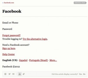
“First Article” would find the first news item in the home stream. This is clearly not what Facebook intended, since they placed the @role=main on the center column, above the first blog post’s title. “First Article” would miss that title and the status posting.
The “readability” result again disappoints but warns that it failed:

YouTube.com
A video page would likely be built with:
- a <header> bar for the search and login bar
- a <nav> for the menu
- a <div> to contain the rest of the page
- a <header> for the video title and channel links
- a <div> to contain the video with controls
- a <div> to contain the center and right column
- an <aside> for the right column with an <article> per related video
- an <aside> for the information below the video
- a <article> per comment below the video
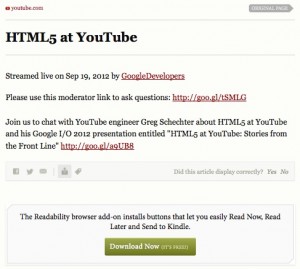
“First Article” would find the first related video or comment in the home stream. This is clearly not what YouTube intends.
The “readability” result is not quite as unusable, but still very bare:

Wikipedia.com
http://wikipedia.com (“Overscan” page)
A Wikipedia page would likely be built with:
- a <header> bar for the search, login and menu items
- a <div> to contain the rest of the page
- an &ls; article> with title and lots of text
- <article> an <aside> with the table of contents
- several <aside>s for the left column
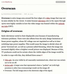
“First Article” would find the title and text of the main element on the page, but it would also include an <aside>.
The “readability” result is also in agreement.

Results
In the following table we have summarised the results for the experiments:
| Site | Scooby-Doo | First article | Readability |
|---|---|---|---|
| Google.com | FAIL | SUCCESS | FAIL |
| Facebook.com | FAIL | FAIL | FAIL |
| YouTube.com | FAIL | FAIL | FAIL |
| Wikipedia.com | SUCCESS | SUCCESS | SUCCESS |
Clearly, Wikipedia is the prime example of a site where even the simple approaches find it easy to determine the main content on the page. WordPress blogs are similarly successful. Almost any other site, including news sites, social networks and search engine sites are petty hopeless with the proposed approaches, because there are too many elements that are used for layout or other purposes (notifications, hidden areas) such that the pre-determined list of semantic elements that are available simply don’t suffice to mark up a Web page/application completely.
Conclusion
It seems that in general it is impossible to determine which element(s) on a Web page should be the “main” piece of content that accessibility tools jump to when requested, that a search engine should put their focus on, or that should be highlighted to a general user to read. It would be very useful if the author of the Web page would provide a hint through a <main> element where that main content is to be found.
I think that the <main> element becomes particularly useful when combined with a default keyboard shortcut in browsers as proposed by Steve: we may actually find that non-accessibility users will also start making use of this shortcut, e.g. to get to videos on YouTube pages directly without having to tab over search boxes and other interactive elements, etc. Worthwhile markup indeed.
Hi Silvia, I don’t agree with your statement:
“Thus, the ease of styling a element is only a positive side effect and not actually a real use case.”
what we know is that around 40% of pages have (usually) a div with an id value that identifies it as the main content area of a page. Developers do this fora reason and most of the time its not for accessibility reasons, but as a styling hook. I went and looked at some pages in the data set I used and found the #id value that indcated the main content area was often used in CSS style declarations.
@Steve There is a difference between a div with @id=main being used as the main styling area and one being used as the main content area. The latter is the concept that is of more interest. It is more useful from an accessibility POV and should not include for example menus.
However, even if Web developers get this wrong, the result is not disastrous – at worst the blind person lands just “almost” near the main content, instead of directly there.
@Silvia, sure I am not saying it is a reason to add main, but when asked about uses cases for elements like nav and header, hixie throws up styling as one of them and lack of usefulness for styling has been cited as a reason that main may fail, which I don’t think is correct.
@Steve My article above is focused around reasons to add main. I did say that it is useful for styling. So it seems we agree.
I don’t know Hixie’s reasons for objecting to main, but I think that Hixie probably has a lot of experience with the kind of things that cause confusion among spec users and (main) seems like a prime candidate, much as article and section are causing confusion currently.
Unfortunately, confusion with -what- exactly should be / will be main content will probably have more broad reaching effects on it’s utility than the more scoped article and section.
I’m also sad to see the element’s potential to cement the very static and unimaginative interpretation of web pages in terms of news paper articles, at a time when web apps, canvas, and load-everything javascript are moving us into areas beyond such static fare for the web.
Err, just to clarify what I mean by effects on it’s utility, I could easily see developers using main as a wrapper for all content in the body, or all non-header, non-aside content, and a variety of other approaches, and main failing to have consistency.
Even in cases where main content is used to bring the core content to the fore and all else to the background, that core content may encompass so much raw html and content that the utility of jumping to main or highlighting main may be minimal.
Hopefully that doesn’t happen, but those are the kind of problems that I would be looking out for as a spec editor.
@Roy All we are after is to make blind users’ lives easier. Maybe read http://blog.silktide.com/2013/01/things-learned-pretending-to-be-blind-for-a-week/ to understand the problems better.